|
|

Duhan CÜCÜ
Programmer

Nigar YÜZ
Accounting Secretary
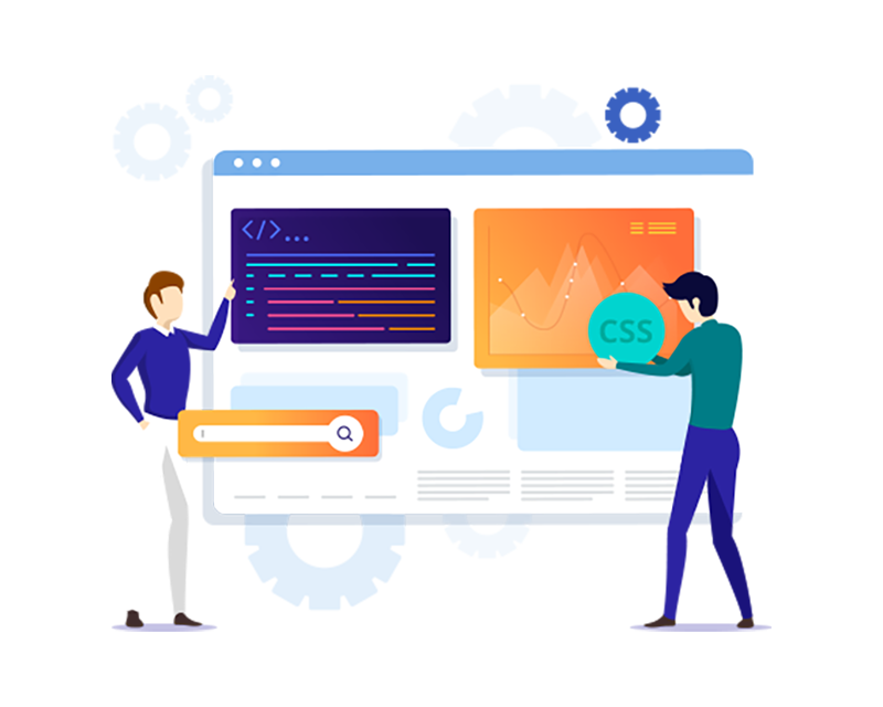
We design and develop modern, fast, and user-friendly online stores that support the growth of your business.
Our e-commerce solutions are visually attractive, mobile-friendly, and optimized for search engines.
A unique online store design tailored to your brand
Mobile and tablet compatible (responsive design)
Clear and easy-to-use product and checkout process
Search engine friendly structure (SEO)
Fast loading time and high performance
We develop online stores based on customer needs, for example on the following platforms:
WooCommerce (WordPress)
Shopify
Magento
PrestaShop
Zen-Cart
Custom PHP-based solutions
We integrate popular and secure payment methods and delivery solutions into your online store:
Online banking, card payments, invoice, and installment payments
Paytrail, Vismapay, Klarna, and PayPal
Posti, Matkahuolto, and other logistics solutions
You will receive full access to your online store.
You can manage products, prices, orders, and content yourself without technical knowledge.
An online store is typically completed within 3–5 working days depending on the scope of the project.
We want to make shopping online as easy and secure as possible. That’s why we offer a clear shopping experience, high-quality products, and a service you can trust. Thousands of satisfied customers have already chosen us – welcome aboard!
High-quality and carefully selected products
Competitive prices without unnecessary intermediaries
Fast and reliable delivery
Secure payment methods
Customer satisfaction guarantee
Friendly and fast customer service
Do you want a high-performing and easy-to-use online store?
Contact us and request a free quote – let’s design the perfect online store for your business together.
Prices include vat 0,0 % Compare all features
Prices include vat 25.5% Compare all features

Responsive websites serve customers regardless of the device they use. They work smoothly on all devices: mobile phones, tablets, mini laptops, laptops, and both large-screen and small-screen desktop computers.
Is it necessary to create completely new websites if the current ones are otherwise good? Not necessarily. Existing websites can also be made responsive if their code structure allows it.
Responsive web design does not simply mean that pages open or that they can be read on a smartphone. It means that the pages are comfortable to browse. Users do not need to constantly zoom in and out with their fingers or wonder how to save a phone number to make a call.
With well-designed responsive websites, everything is simple. You can clearly see the text, it is easy to read, and you can tap a phone number to call it directly. This is what we expect from modern technology when it is designed to improve the user experience.


© 2012 - 2026 Nida Verkkopalvelu All rights reserved.